Implementing Dark mode with TailwindCSS
TailwindCSS is probably the most popular utility-first CSS framework, I like it because it gets out of your way and gives you great primitives to work with to build any design system or achieving perfect replicas of your fellow designer’s work.
I re-did this website in TailwindCSS and since I already implemented my website in a dark-mode, decided to throw in support for light-mode if the user prefers light schemes.
The goal is simple, I need to implement a light-mode variant that I can prefix tailwind classes with. At first I stumbled upon tailwindcss-dark-mode plugin which seems to do the job but I was interested in an easier approach, a plugin seemed an overkill for my needs.
I more or less just need to generate these media queries:
css.App {
  background: black;
}

@media (prefers-color-scheme: light) {
  .App {
    background: white;
  }
}
Very simple right? But I want tailwind to do it for me and I want it to look like this:
vue<div class="text-gray light-mode:text-dark-light">
  Some content about random stuff ....
</div>
As you can see I wanted to have a light-mode: variant available that can be prefixed with all tailwind stuff and I also wanted to have it supported in the postcss blocks in my code:
css.App {
  @apply bg-dark text-white;
}

/* Maybe a custom directive? */
@light-mode {
  .App {
    @apply bg-white text-dark;
  }
}
The problem is that I don’t know how to write a postcss plugin to add a custom directive nor I really have the time to jump into tailwind plugin API and try to hack something together.
Then I remembered the screens config!
Screens to the rescue
TailwindCSS has this concept of screens which you can use to make some elements responsive in some form, by default you have those screens pre-defined: xs , sm, md, lg and xl which are an abstraction for the following CSS media queries:
css/* Small (sm) */
@media (min-width: 640px) {
  /* ... */
}

/* Medium (md) */
@media (min-width: 768px) {
  /* ... */
}

/* Large (lg) */
@media (min-width: 1024px) {
  /* ... */
}

/* Extra Large (xl) */
@media (min-width: 1280px) {
  /* ... */
}
Now that isn’t really helpful for my case but I was curious if I can create a light-mode screen definition, it would get me exactly what I want. I decided to dig deeper into the docs as they probably have some guidance on that subject, and there it was in the Custom media queries section!
They had snippet for working with print queries that looks like this:
jsmodule.exports = {
  theme: {
    extend: {
      screens: {
        print: { raw: 'print' },
      },
    },
  },
};
Which will compile to:
css@media print {
}
So that means by passing in an object containing a raw property, I could practically write any type of media query I want. So I tried the following:
jsmodule.exports = {
  theme: {
    extend: {
      screens: {
        'light-mode': { raw: '(prefers-color-scheme: light)' },
      },
    },
  },
};
And it worked, it worked splendidly.
The rest was just a matter of figuring out lighter color variants and add them in, it took overall 15 minutes to just come up with what you currently see if you already set it to use light color scheme in your OS settings.
Here is a few snippets of my current code, note the light-mode: prefixes:
css.SpeakingCard {
  @apply flex flex-col shadow-lg border border-dark w-full bg-dark-light relative;
  transition: border-color 0.3s ease-in-out;

  &:hover,
  &:focus-within {
    @apply border-accent;
  }
}

@screen light-mode {
  .SpeakingCard {
    @apply border-gray-lighter;
  }
}
Here is a few HTML snippets:
vue<div
  class="w-full h-full bg-dark light-mode:bg-white absolute w-full h-full"
>
  ...
</div>

<div
  class="text-gray light-mode:text-dark-light text-lg mt-auto"
></div>
...
<div
  class="flex mt-4 z-10 bg-dark-light light-mode:bg-gray-lighter px-4 md:px-16 py-4 justify-between items-center font-display"
>
  ....
</div>
Bonus: Debugging
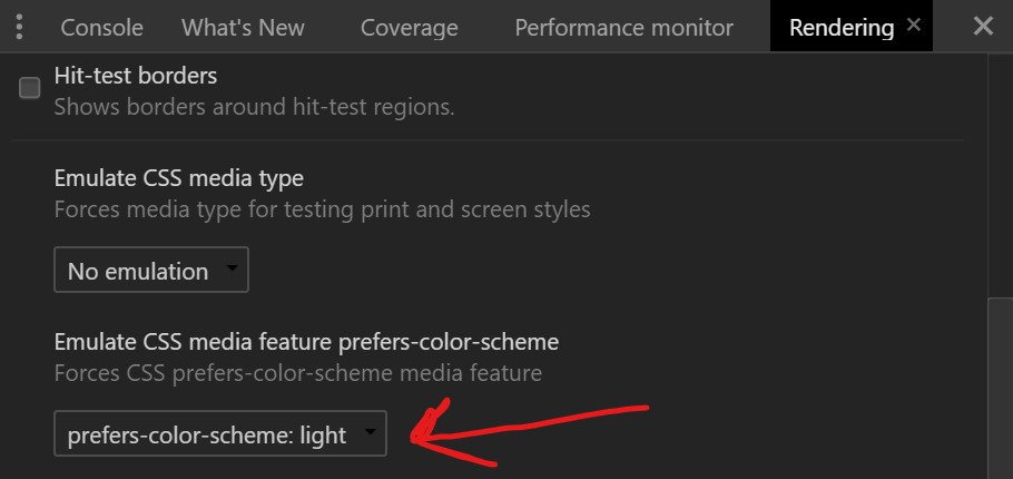
If you want to debug color scheme settings without having to keep switching your OS settings, chrome implemented an emulator for it that you can find in:
DevTools -> More Tools -> Rendering -> Emulate CSS media feature prefers color scheme
And that’s how you implement dark/light in under 15 minutes with TailwindCSS!